Author: Rhea Fontaine
1st Dibs: Ask An Expert Interview with Rhea Fontaine
In The Gallery: Wholesome Encounters
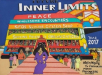 Untitled (Future Inner Limits), 2021
Wholesome Encounters explores themes and motifs present in Paulson Fontaine Press’s newly released edition by William Scott, Untitled (Future Inner Limits). Scott’s extensive painting practice includes portraits and cityscapes that imagine Black figures—mainly celebrities, civil rights leaders, and members of the artist’s community—in a more equitable society. Scott develops alternative realities and visions for the future centered around the mission to “promote peace on earth and good wholesome human behavior.” In Untitled (Future Inner Limits), Scott depicts a group of people aboard a train and describes the passengers as “wholesome, humorous, peacemakers building a better world for the 21st century. No more scary people, monsters, horrors.” While his works are hopeful projections for a bright future, Scott simultaneously confronts the viewer with a reminder that in our current society, the inequality, tragedy, and loss that the passengers are escaping still exist.
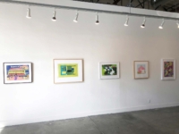
To expand on the vision William Scott puts forth, presented are prints from a variety of artists whose work, in one way or another, embodies his alternative ideal future. Each piece in the show touches on a form of utopia, escape, or idealism, doing so with an enticing color pallet and inherent otherworldliness. These prints point toward a bright future and the dawn of a new generation. Depictions of fresh flowers, a pristine home, and energy bursts contribute to this sense of optimism. These prints don’t deny the existence of the messy, complicated, unjust, and even scary facts of life, in fact, they are more powerful because of them.
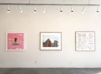
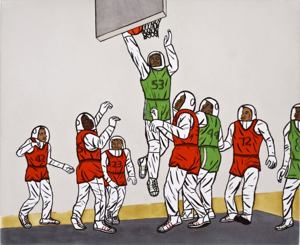
David Huffman’s Basketball Pyramid confronts the duality of basketball and it’s symbolism. On one hand, the sport represents African American dreams realized and community for young men and women, and on the other, the objectification and exploitation of those same bodies. In Spencer Finch’s Back to Kansas, a colorful abstraction of the film The Wizard of Oz, the vivid colors of Oz and Munchkinland are placed next to the green of the Wicked Witch and the gray of smoke that billows in her presence. As a passenger aboard William Scott’s Future Inner Limits, the viewer of Wholesome Encounters is ushered in by Chris Johanson’s Energy 1, a burst of positive intentions and infinite possibilities. As we move into the future these works choose beauty, peace, comfort, compassion, and community because imagining a brighter future is the first step in attaining one.
-Lucy Stark
![]() Spencer Finch, Back to Kansas, 2015
Spencer Finch, Back to Kansas, 2015
 Louisiana Bendolph, History, 2007
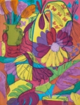
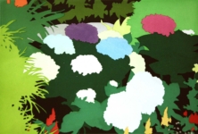 Kota Ezawa, Flowers, 2009
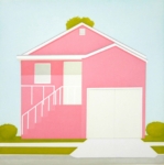 Salomon Huerta, Untitled (Pink House), 2001
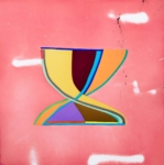
 Woody De Othello, About That Time, 2021
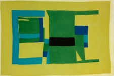
 Alicia McCarthy, Z, 2018
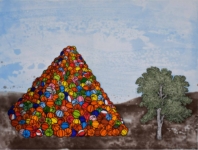 David Huffman, Basketball Pyramid, 2007
![]() Chris Johanson, Energy 1, 2018
Chris Johanson, Energy 1, 2018
Woody De Othello at Paulson Fontaine Press
Woody De Othello Featured in The San Francisco Chronicle
Isca Greenfield-Sanders: Convertible
Alicia McCarthy: Untitled (2)
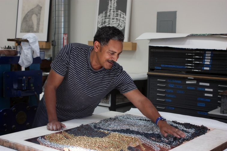
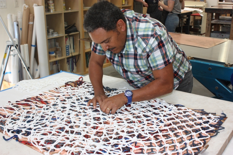
In the Studio at Paulson Fontaine Press
A glimpse inside the printmaking studio at Paulson Fontaine Press with Oakland-based artist David Huffman.
Interview with David Huffman
David Huffman grew up in Berkeley, California in an activist household during the 1960s civil rights movement. In 2007, David’s first prints with the press worked with stereotypical American racial iconography. He arranged rich compositions that explored identity and socio-political history in a futuristic world of metaphor.
David became known early on for his crew of astronauts he calls “Traumanauts”. On their missions they searched for the inward and outward makings of identity, taken from them by their experience of repression on Earth. His iconic character Trauma Eve, an Aunt Jemima space robot, is unforgettable. Toxic air, poisoned water, and the AIDS virus are no match to her strength. She is a symbol of a particular type of rebelliousness that carries the burden of an embattled past and fights against a history of violence and oppression.
Over the last ten years David has distilled his concerns and issues around identity into basketball abstractions, which he considers social abstractions. Basketball has been an enduring trope in African American art, from the conceptual efforts of David Hammons and Mark Bradford to the charged photos and videos of Paul Pfeiffer.
Can you talk about being raised in Berkeley and how that may have influenced you, your thinking and your work.
David Huffman: When I was a kid growing up Berkeley was definitely in a time of transition. The civil rights movement was percolating and political intrigue was the common topic on the news. The same things that were on the news were happening on the streets, and so protests were a constant performance. Not a performance in the sense that they were fake or pretending, but a performance in the sense that it was something that you actually did. It was like, where were you gonna protest? And who’s gonna make the signs? Everyone would galvanize their families. My Aunt Norma and my mom Dolores were very involved and were friends with Bobby Seale. The first time I carried a protest sign I was about five, so that would have made it 1968. A lot of the picketing we were doing was about fair housing, fair wages and employment. There was this spectrum of social woes that we all felt. At times there was a lot of reluctance on my part because I would rather be watching cartoons on Saturday, but at the same time you couldn’t help absorbing the injustice of things. So I definitely had a default to a kind of fair play because things aren’t fair. And even though I didn’t want to hold a picket sign all the time from age five through eleven, I understood that someone should be doing this, and so why not myself?
Did your mom making visuals for a political movement inform you becoming someone who communicates ideas visually?
DH: My mom was already an artist before she did stuff for the panthers. She did these figures called “Nevers” that were very psychedelic, exotic looking black figures that were mostly women. So she was always making art and I picked up on that. Everybody kind of made a little bit of art. I made some art and my sister made art. Grandmother was an artist for awhile herself. So art was a part of the family growing up. I didn’t think of the protest stuff as art. I just thought oh you have to do this panther thing and you have to silk screen it on stuff and add the text. To me that didn’t look like art at all. Art was always something we kind of did but we didn’t call art, we just drew. We also had a lot of art around the house. We had a lot of original stuff from my mom’s friends and a longtime boyfriend who was a painter. He painted kind of like Van Gogh, so we had these pseudo-Van Gogh paintings framed in gilded frames. It was pretty wild. There were also black light posters. And black power posters, maybe one with a black couple looking perfect with huge Afros laying intertwined, maybe with a panther by them. And we had panther stuff, like a ceramic panther on our table, which was kinda common. We had wicker stuff, the same big wicker chair that Huey had.
That’s become quite a symbol.
DH: Yeah, my aunt gave him one. She thought she gave him the one that they used for the famous photo shoot. But I was talking to Bobby Seale and he remembers when she gave him the chair, and he said the one that they used for the poster was from a house in San Francisco where they did the photo shoot. My aunt always thought it was her chair because she gave it to him around the same time.
Was there something to this wicker chair, or was it just a popular look?
DH: The chair was a part of this connection to Africa that started to gain a lot of attention in African American culture and popular culture in general. It was mostly focused on West African countries and cultures. I remember Swahili was a popular African language that people were trying to learn. So the wicker chair became part of this connection to Africa. The spear and the shield were very popular too. There was kind of a hodgepodge of ethnic accoutrements.
Do you think Berkeley made this exploration easier?
DH: I don’t know because I grew up in Berkeley, so I don’t know how it was in other places, but most people would flock to Berkeley for the energy. We lived right near Telegraph Avenue, right in the heart of the protest area in Berkeley. I remember the really heavy time when Reagan called the national guard out against the protesters. I was maybe five or six years old and it felt like we were under siege. To keep things calm they blocked off streets and barricaded some with barbed wire. To see the national guard come up your street in different vehicles and riot gear, big face visors, shields and clubs was just shocking. It was war. They would run in single and double file and the sound of their boots and the clanging was terrifying. I remember going to a theater right off of Telegraph and seeing the movie “When Worlds Collide,” a very popular science fiction movie at the time, and wanting to get away on a rocket! The premise of the movie was that the moon crashed into the earth and it was going to blow up or disintegrate and they built a rocket for everybody to get on, but it was all white people that got on – haha – and they went to a paradise land. That’s what you wanted to do because it was a very crazy time.
Very stressful.
DH: Yes
Let’s talk about how sci-fi and this idea of escape might influence your work.
DH: In the sixties people were thinking about the space program and the possibilities of looking for another world or finding things outside of planet earth. The space race permeated science fiction narratives and subjects. Take Star Trek for instance, the Enterprise was an advanced ship that could go the speed of light and held a diverse crew. The landscapes of science fiction offered up a new way to deal with issues in life. You felt somewhat free, possibly politically free in these spaces. In sci-fi there is a sense of modern freedom; you can create stuff, imagine things, and lead and steer in your own right. I think that is the element of being a full citizen in any country. During the civil rights movement the fight was to be a citizen and have the same rights, so I think in some ways science fiction offers up the possibilities in that way.
When I started making the Traumanauts they were based on some of the excursions that the Apollo program focused on. I would re-situate the narrative for my own purposes, like the figures would actually be looking at a lynched tree rather than ending up on the moon. I would borrow some of the ways in which they prepared themselves and the ways they interacted with alien spaces. So yeah it became an open space for me to discuss issues about African American culture, history, life and things that I thought were unsaid or perhaps not said enough.
What prompted the shift from narrative and figurative works into abstraction?
DH: I felt like I had said quite bit in those kinds of spaces and I decided to take on paintings as a state of experience. I also began exploring the idea of dark matter. I have always been interested in things that were connected to Nuclear Physics, Astrophysics and Astronomy, and by the 1990s dark matter had become a really compelling subject in science. I was hooked when scientists started discussing dark matter because of all the social and political implications related to the theory. Anything that is unknown gets a dark labeling. So I was curious as to why it was being called dark matter. Was it actually being seen as dark? So I started looking for why it was being called dark matter and it was being discussed as this unrecognizable, unconscious thing that was outside one’s ability to know. And I thought, well these are some of the same qualities of racism too; the way that black people can be abstracted in White American culture. It’s about not knowing, not seeing and labeling in a way that is a whole of not understanding.
I wanted to make work around dark matter and I couldn’t do it narratively. When I first started trying to paint it, I painted this kind of undulating dark space with dark hues and shapes, but it just didn’t solve the content for me in that way. I started looking at how I was using basketballs up until that point narratively and started experimenting by making paintings with basketballs only. The critical mass that started to happen by putting so many basketballs down forced me to think abstractly. It was a different kind of abstraction. An abstraction in a way that black people are abstracted by white american culture, in a way that whites see black people or see through them as invisible. This abstraction has a strong connection to the stereotypical tropes of identity and the icon of the basketball being really loaded as well.
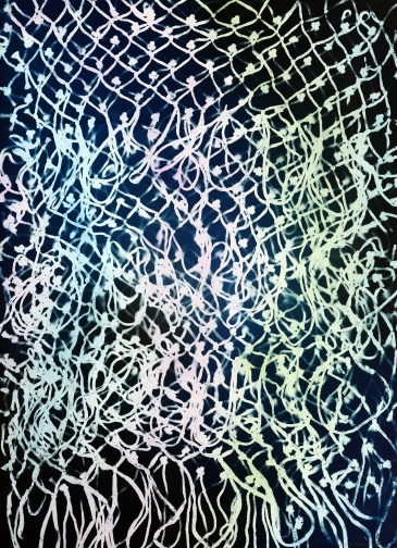
We’re really excited about the new prints that you made with us using basketball nets and chains. How did the process in the studio feel and where is this new work taking you?
DH: Getting the materials and using them in the context of printmaking was really eye opening, because printmaking definitely has its own dynamic. It became a process of just going with what the work was going to do, which doesn’t sound that different than how a lot of artists make work, but for me it was quite different. I have many different strategies that I use when making my work, and I thought I was just going to perform them, but the materials offered up new and surprising choices.
I found it helpful when Pam and the crew came up with suggestions about etching processes. Thinking about “Rainbow” for instance, I was really surprised how that turned out. I was surprised that it was a rainbow, a kind of worn rainbow that perhaps was toward the end, right before it vanished. It captured this elusive nature of rainbows, the feeling of both being sad it was over, but still quite interested that it had occurred at all.
Paulson Fontaine Press Featured in the East Bay Express