Christopher Brown continues to be a distinctly American artist. He depicts large and small scenes of life as it is lived, or partially remembered, in this country. Yet his scenes are grounded in one specific moment. Brown uses paint to allow for ambiguity and distance. Despite his masterful use of color, his pieces often feel cool. His interpretation of the Zapruder film of the Kennedy assassination is at least one layer removed from the event and so no longer as horrific. There have been bucolic backyard scenes, toy logs and farm animals, trains, and soldiers that stir memory but not passion. The imagery is highly personal to the artist’s life, yet accessible to many viewers because of its familiarity. The reworking of the paint, the smearing, smudging, and scraping, allows each viewer to build his or her own narrative around the frozen moments. Most of his work is representational, but no more prescriptive than the work of abstract artists.
Christopher Brown, Blue Road, 2011; Oil on linen; 30″ x 40″; Courtesy of the artist and John Berggruen Gallery
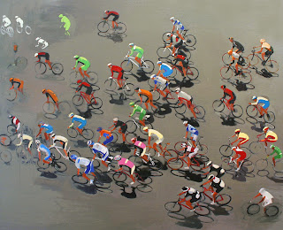
Each new show promises an examination, or sometimes reexamination, of imagery that holds special resonance for Brown. In the current exhibit at John Berggruen Gallery (through March 17), most of the paintings depict the near-ubiquitous weekend cycling tournament up a mountain (feels like Marin to me), the horse race from the unlikely view of someone behind the dirt kicked up by the animal’s hoofs, and a few stray images of ancient red coat soldiers, sailboats, and family trips to the snow.
Christopher Brown, Peloton, 2011; Oil on linen; 48″ x 60″; Courtesy of the artist and John Berggruen Gallery
In the recent cycling series, dozens and dozens of thin circles merge into a near abstraction, like Monet’s water lilies. Amidst the hard and monotonous work of pedaling up a mountain are the bright jerseys of the riders and friends and hundreds of shades of green hills. One jersey was worked so beautifully I thought it resembled a miniature Rothko. Brown captures the tension between the vulnerability of the hard-pumping rider on a thin machine and the steep and dangerous curve. Half a redcoat soldier walking in the mud is not grotesque, but like a partial memory. When focusing on a ship’s great billowing sails, swaths of paint look like an angel’s wing. But I was most drawn to a smaller piece entitled “Blue Road,” in which a family or group of friends has stopped along the road to entertain themselves with a snow fight. Instead of resembling mounds of white, the drifts recall the eerie blue of gigantic glaciers. Brown’s paintings can take you anywhere, even back to the ice age, but more likely to your own past.
At Paulson Bott Press, instinct, and even passion, directs the selection of artists. This is how the press came to work with the women from the Gee’s Bend, Alabama, quilt collective. A quilting center since before the Civil War, Gee’s Bend is known for colorful, quasi-geometric designs that, although based on historical American and African examples, appeal to a modern art sensibility. The highly successful multi-museum tour of Gee’s Bend quilts organized in 2002 by the Museum of Fine Arts, Houston, brought international fame to this small, rural community. Pam Paulson happened to see that exhibition when it was presented in New York at the Whitney Museum of American Art and fell in love. When she showed the catalog to her father, he suggested the press invite the quilters to make prints. Long story short, Pam and Renee Bott were able to interest two generations of quilters –Mary Lee Bendolph, whom Pam calls “ the heart and soul of the Gees Bend quilters,” and her daughter-in-law Louisiana Bendolph.
Gee’s Bend, Alabama, circa 1937; Mary Lee Bendolph, Past & Gone, 2005
Once they had a commitment, Pam and Renee needed to figure out how to capture the essence of Gee’s Bend quilts in an entirely different medium. They bought sewing machines so that the women could compose their prints by piecing small quilt tops. The elder artist followed the tradition of using worn clothing that she believed carried the presence of the former owner, while Louisiana Bendolph preferred new, bright, solid-colored fabrics. After the artists and printers chose the best designs for prints, the printers made impressions of the quilted pieces with soft ground. Pam remembers, “Each time we pulled a proof there was a hallelujah or a praise Jesus. Often in a quiet moment Mary Lee would break into a gravelly soulful rendition of a church song accompanied by Lou’s rhythmically syncopated clapping.” A second project included two more quilters, and, like the first, resulted in a dazzling array of images—evoking such modern masters as Paul Klee and Stuart Davis but with a spirit all their own. While it’s true that etchings and quilts are two different animals–obviously the prints have no texture or functionality–the designs translate magnificently from one medium to the other, and, like quilts, etchings are hand-made and in their own way evoke the hand of the maker.
Thanks to their experience at Paulson Bott, the quilters now think of themselves as artists. And, they appreciate that through the distribution of their graphic images their work has become appreciated by a wider public.
Mary Lee Bendolph in Paulson Bott Press Studio
I begin with the Gee’s Bend project, because it demonstrates the press’s approach: the artist’s vision comes first; Pam and Renee then find a way, even if it means inventing and developing new techniques, to realize that vision. For Chris Ballantyne, it was printing on Gampi (translucent Japanese paper) and affixing the color prints to plywood so that the grain showed through (an effect the artists was using in his work at the time). For Isca Geenfield-Sanders, Renee, along with Don Farnsworth of Magnolia Press,devised a method of putting a digital image directly onto a copper plate without using a darkroom. And, when Radcliffe Bailey returns to the press next year, they hope to use some of the techniques they mastered in creating a recent series of the artist’s monoprints, which combine sewing, chine colle, printing, dying, and collage. Conversely, Bailey is applying the new tools he learned at the press to his studio work. In other words, at Paulson Bott, artists not only benefit from the broad dissemination of images that multiples afford, but they are expected to approach the medium creatively, to explore, with the master printers as guides, the medium’s unique characteristics. Most importantly, as noted in the cases of Gee’s Bend, and Bailey, just two examples among many, printers and artists working collaboratively can arrive at new techniques and methods that expand not only the possibilities of printmaking but of the creative process itself.
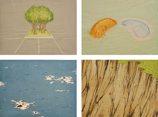
Chris Ballantyne, Untitled Berm, Pool, Submerged Rocks, Cliff, 2004
From the beginning Renee and Pam have worked with local artists, recognizing that the San Francisco Bay Area has a vibrant and varied art scene that too often is not adequately acknowledged. They have built strong relationships with such established Bay Area artists as Squeak Carnwath, Christopher Brown, Hung Liu, and Deborah Oropallo, but also support the region’s emerging artists like Kota Ezawa, David Huffman, Shaun O’dell, and Tauba Auerbach, whose careers they have helped foster. The press also collaborates with such prominent, national figures as Martin Puryear, Caio Fonseca, and Kerry James Marshall. There is no house look – something the owners agree is to be avoided. Styles range from Greenfield-Sanders’s charming figurative domestic scenes, to the cartoon realism of Mission School artists Chris Johanson and the late Margaret Kilgallen, to the abstract cosmologies of Ross Bleckner.
Isca Greenfield-Sanders, Blue Suit Bather, 2006
Located in a sun-filled studio and gallery in Berkeley, Paulson Bott Press has established itself as a leading intaglio press and publisher, not just on the West Coast, but nationally. Their prints are now found in major museum collections across the country, including the Museum of Modern Art, Whitney Museum of American Art, and the Brooklyn Museum in New York; the National Gallery and Hirshhorn Museum and Sculpture Garden in Washington, D.C., among many others.
While we can’t predict what’s to come as Paulson Bott enters the next phase, based on its history we can be confident that it will be both surprising and, somehow, just right.
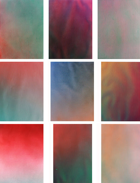
Tauba Auerbach does not accept the obvious. She likes to experiment, even to invert. During her recent visit to the press, she created a series of monoprints in which she focused on what the press does, on its power, rather than on how it fuses ink with paper. Her goal with the monoprints, as with much of her work, is to capture evidence of process.
Tauba began by embossing paper. She wasn’t trying to mimic her fold paintings or any other work. She visited a hardware store and purchased a number of ordinary items, including a wire grid, a rubber mat, textured plexiglass, and chicken wire. She then ran sheets of paper through the press over these objects to create grids, parallel lines and patterns.
The raking color seen in the prints is the result of using an airbrush at an oblique angle against the ridges created by the embossment. She would spray a few layers of paint, wait for them to dry, and then proceed. In some cases when the paper got wet, it began to undulate. Auerbach wanted to record that change, which resulted in a topological record.
Eventually the paper was gently flattened. Similar to her fold paintings, the undulations disappear as physical forms and remain recorded in the paint.
Tauba Auerbach, Embossment Paintings, 2011
As she commented in the interview in OKTP, she often destroys a large number of pieces before finding one that works. In the case of these monoprints, she kept only 14 of 30.
In these new works, Auerbach is not trying to exert control over certain elements. The joy is in the experiment. She is comfortable with the idea of the piece, and she either accepts or rejects the finished work. The absence contributes to those that remain.