Liam Everett

Liam in the studio sanding a copper plate


It’s not uncommon for artists to enthusiastically tell us that working at Paulson Bott changed the way they think about making things in their studio. We‘re always pleased to hear this, though not terribly surprised. Artists tend to be restless and self-reflective. The process of printmaking is slow, indirect and abstract. It requires thinking in layers, rendering shapes as negative space and conceiving the composition in reverse. The process of making a print is like designing an exploded diagram. The end result’s cohesive and unified final appearance belies a complex assembly. This process has a tendency to make artists evaluate their habits and routines in a different way. These revelations tend to yield minute changes, but in the case of Liam Everett, it spawned a significant departure.

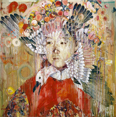
When Liam came to the studio in 2013, he made nine editions and three monoprints. The monoprints and the rondo editions are closely related to the work he was making at the time, which incorporated draped silk and wooden structures that avoided traditional flat, rectilinear framing. The six monochromatic pieces however were a departure. They balanced a traditional intaglio format and methods with the primordial materiality of his paintings, which are evocative of natural phenomena and chance. Liam came back in April of 2014 to make Untitled (Siguer) after we expressed interest in creating a large print in the vein of his current paintings. The new paintings are large and atmospheric, with moments of Technicolor intensity that are the stubborn residue of sanding through many layers of paint. There’s a quality that reminds me of weathered frescoes. I find that I am continually delighted by the remarkable difference between his paintings, despite their undeniable family resemblance. How does their distribution of color, texture and form seem so grounded, yet appear casual and incidental? They feel effortlessly balanced. Things happen where they need to happen and in a manner that’s appropriate to the whole. I was surprised (though I shouldn’t have been) that all the paintings start as drawings. Liam literally makes an architectural framework of DeChirco-like arches and columns with strong diagonals that are subsequently buried under layers of lyrical abstract marks. This architecture is crucial to their success. It provides a rhythm on top of which he can improvise. In retrospect it makes sense that during his time in the studio there were as many discussions about music (jazz, electronic, drone, pop, ambient, reggae, noise and metal) as there were about art. There’s a definite skepticism about the expressionistic dimension of their painterliness, but they never feel ironic.

Liam with Master Printer Sam Carr-Prindle

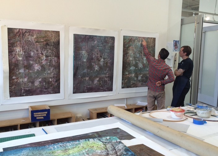
While we were making Untitled (Siguer), Liam said that his current work was a direct result of working on the six monochrome pieces, which involved pressing the plates into asphaltum, open etches in the acid, sanding and alternating between additive and subtractive processes. The lessons he gleaned from making the prints don’t have an obvious 1:1 translation into the current paintings, but was more of a catalyst for evolving. He said that biggest revelation came from working with the acid. The physical distance built into the process (don’t touch the acid) encouraged him to consider a means of making a painting through means that aren’t a result of his hand or will. They also share a process of topographical erosion.

Liam may not have a definite picture of what a finished piece will look like, but he does establish parameters and a direction in which to move that is more like an educated guess than a blueprint. He starts by creating an obstacle, explores several of the permutations possible in a limited set of decision and moves towards resolution. The end result is never more important than the process. Failure is always a possibility, though he has a knack for succeeding, – which suggests that their hard won elegance is by no means dumb luck. Any unequivocal failures can always be cannibalized for their worthwhile qualities. Liam has said that a painting is finished when it no longer feels like the product of his conscious decision-making. He wants it to feel alien and “assert itself”. Liam would frequently ask us to make minor decisions while creating the plates in order to yield an unforeseeable element to respond to and assist in the process of distancing the work from his hand.

Liam Everett’s working method is in some ways similar to the definition of play proposed by the famous Dutch historian Johan Huizinga in his book Homo Ludens. Huizinga sees play as game-like in that it must to follow a set of rules or a structure. He asserts that play is always free, creates it’s own order, and isn’t done for utilitarian needs. Despite the rigidity and limitations of Huizinga’s definition of play (rules and frameworks are always up for play too), it makes a good argument for the importance of doing things for their own intrinsic value and pleasure. I can’t help but feel that there is a political metaphor in Liam’s art: setting up scenarios that allow for unpredictable, advantageous surprises to occur, without needing to force conformity to a predetermined ideal.

The artists aren’t the only one ones who are shaken up in the print studio. Artist’s frequently throw us a curve ball by innocently asking if we can do something. We have a familiar and dependable set of techniques, but they’re constantly being tailored to satisfy the needs of our artists. And Hallelujah for that! The necessity for experimenting and inventing on the fly keeps this extremely repetitive process exciting.


Lonnie Holley

Lonnie Holley is an incredibly talented and versatile artist who expresses himself through sculpture, music, painting, and almost everything he experiences. He has overcome unthinkable hardships in his life but has managed to come out on top, maintaining his own unique and positive outlook on life. On our first day of work in the studio, Lonnie said, “I want to learn as much as possible from you, but at the same time, I want you to learn from me.” I was thrilled to be in charge of his first project at Paulson Bott Press.

Lonnie makes art out of anything and everything within his reach. One day, he went down to the nearby train tracks for some inspiration and came back with an assortment of debris, including an old tarp, tiny metal scraps from trains, and slabs of pale cement. When he set these materials down on the studio table, I felt a little anxious and wondered what he could possibly make out of them. But within minutes, he had come up with multiple concepts and created an intriguing sculpture of a boat and a face. He is a masterful improviser.

Lonnie Holley, The Things of Life (To See or Not to See), 2013. Color aquatint etching. Published by Paulson Bott Press

Intaglio was a new medium for him, yet he was able to embrace the various techniques seamlessly. By layering three-dimensional objects onto the softground plates, Lonnie found a familiar way to construct prints. His sculptures bend themselves perfectly to this printed form, allowing him to create work that remains true to his vision. His music shares improvisation and invention as well. You can listen here. 


Hung Liu

Last September Hung Liu returned to Paulson Bott Press for her fifth project. All of us at the press look forward to her enthusiasm and her wide-ranging humor. The first time I worked with Hung Liu in 2008, I expected her to be stoic and severe, given the heavy content of her work. However, I was surprised and pleased to discover that despite her seriousness, she carries herself with an almost child-like cheerfulness and curiosity. There is a good deal of laughter when Hung is in the studio. She also brings a considerable amount of technical knowledge and confidence to the production of her prints. Intaglio can be a daunting and opaque medium for many artists, but she never seems intimidated by its esoteric challenges and unpredictability. For this project we focused on two large portraits and three small cartoon images based on her Happy & Gay series of paintings.

Hung Liu: Happy and Gay (Thanks Mom, Kite, Flag), 2012

The Happy & Gay images are based around a series of Chinese Dick and Jane-like cartoons for children. The title comes from a song/school exercise for learning English: “Come boys and girls—let’s sing let’s dance. We are happy and gay. It’s our National Day.” The seemingly benign and bucolic images are both familiar and strange. Like their American counterparts, they’re intended to teach a set of wholesome, normative values such as hard work and pragmatism, with a heavy emphasis on the nuclear family and nationalism. Consequently, the fact that these doppelgangers are in the service of the Maoist Cultural Revolution, the loyal opposition of American exceptionalism, makes them feel, dare I say, queer. Such a contrast brings into focus the puritanical undercurrent in both.  Hung goes on to further push these tensions with soft subversions such as the pink clothing, which also evokes the double entendre of the title. Such flamboyance would be contextually deviant even in their American equivalents. The images and phrases of her youth are resurrected, with an irony and an acknowledgement that they no longer embody the meaning they once did. 

Printer Sam Carr-Prindle and Hung Liu in the studio

A former painting teacher of mine once shared a story about a classmate who got in trouble and was ultimately expelled from their academy in the Soviet Union for making an impressionist painting. There was no dissident political content, or satire, just a few fauvist trees, which in an American school would have been at worst derided as quaint or anachronistic. Yet the implied individuality and emphasis on interpretation of feeling were perceived as threatening and subversive to the rigid social order. So in recreating these images in her own hand, and with small expressionistic flares, Hung is slyly breaking the rules that fettered the illustrators and artists forced to work in a state-approved style. In her version, the subjects seem to be tripping the Great Leap Forward.

Hung Liu, Shui-Water and Shan-Mountain, 2012

The two portraits are part of an ongoing series of works that are based on early 20th-century photographs of prostitutes. Many of the photographs are small and lack clarity and contrast, yet she is able to enhance the amount of information while imbuing them with a greater sense of life and naturalism. In addition to bringing her large collection of portraits, Hung also brought in an enviable collection of books filled with small reproductions of Chinese woodcuts, which she used to create the backgrounds of Shan-Mountain and Shui-Water. Both prints started with a softground drawing of the figure that was then built up with many layers of aquatint, drypoint, reductive plate work, and, most notably, spitbite, in which nitric acid is painted onto the plate and allowed to drip and run, echoing the turpentine streaks of her paintings. Similar to the way Hung mixes humor and seriousness, these images balance crude or visceral elements with elegance. The softground has a rough, heavy and weathered quality in the way the lines and shapes are broken up by optical chatter, yet the draftsmanship is masterful and sensitive. The spitbite drips can feel both chaotic and ominous, as if the women were melting wax figures yet the drips in and of themselves are lyrical and painted with an unfussy playfulness. These contrasting elements lend a fitting uneasiness to their beauty. While the women are poised and graceful, the images belie the grim and misogynistic reality of their original purpose.

Hung Liu’s work is never what you think it might be at first glance.


Celebrating 15 Years: Part 1

 By Constance Lewallen


At Paulson Bott Press, instinct, and even passion, directs the selection of artists. This is how the press came to work with the women from the Gee’s Bend, Alabama, quilt collective. A quilting center since before the Civil War, Gee’s Bend is known for colorful, quasi-geometric designs that, although based on historical American and African examples, appeal to a modern art sensibility. The highly successful multi-museum tour of Gee’s Bend quilts organized in 2002 by the Museum of Fine Arts, Houston, brought international fame to this small, rural community. Pam Paulson happened to see that exhibition when it was presented in New York at the Whitney Museum of American Art and fell in love. When she showed the catalog to her father, he suggested the press invite the quilters to make prints.  
Long story short, Pam and Renee Bott were able to interest two generations of quilters –Mary Lee Bendolph, whom Pam calls “ the heart and soul of the Gees Bend quilters,” and her daughter-in-law Louisiana Bendolph.

Gee’s Bend, Alabama, circa 1937; Mary Lee Bendolph, Past & Gone, 2005


Once they had a commitment, Pam and Renee needed to figure out how to capture the essence of Gee’s Bend quilts in an entirely different medium. They bought sewing machines so that the women could compose their prints by piecing small quilt tops. The elder artist followed the tradition of using worn clothing that she believed carried the presence of the former owner, while Louisiana Bendolph preferred new, bright, solid-colored fabrics. After the artists and printers chose the best designs for prints, the printers made impressions of the quilted pieces with soft ground. Pam remembers, “Each time we pulled a proof there was a hallelujah or a praise Jesus. Often in a quiet moment Mary Lee would break into a gravelly soulful rendition of a church song accompanied by Lou’s rhythmically syncopated clapping.” A second project included two more quilters, and, like the first, resulted in a dazzling array of images—evoking such modern masters as Paul Klee and Stuart Davis but with a spirit all their own. While it’s true that etchings and quilts are two different animals–obviously the prints have no texture or functionality–the designs translate magnificently from one medium to the other, and, like quilts, etchings are hand-made and in their own way evoke the hand of the maker.

Thanks to their experience at Paulson Bott, the quilters now think of themselves as artists. And, they appreciate that through the distribution of their graphic images their work has become appreciated by a wider public.

Mary Lee Bendolph in Paulson Bott Press Studio

I begin with the Gee’s Bend project, because it demonstrates the press’s approach: the artist’s vision comes first; Pam and Renee then find a way, even if it means inventing and developing new techniques, to realize that vision. For Chris Ballantyne, it was printing on Gampi (translucent Japanese paper) and affixing the color prints to plywood so that the grain showed through (an effect the artists was using in his work at the time). For Isca Geenfield-Sanders, Renee, along with Don Farnsworth of Magnolia Press,devised a method of putting a digital image directly onto a copper plate without using
 a darkroom.  And, when Radcliffe Bailey returns to the press next year, they hope to use some of the techniques they mastered in creating a recent series of the artist’s monoprints, which combine sewing, chine colle, printing, dying, and collage. Conversely, Bailey is applying the new tools he learned at the press to his studio work. In other words, at Paulson Bott, artists not only benefit from the broad dissemination of images that multiples afford, but they are expected to approach the medium creatively, to explore, with the master printers as guides, the medium’s unique characteristics. Most importantly, as noted in the cases of Gee’s Bend, and Bailey, just two examples among many, printers and artists working collaboratively can arrive at new techniques and methods that expand not only the possibilities of printmaking but of the creative process itself.

Chris Ballantyne, Untitled Berm, Pool, Submerged Rocks, Cliff, 2004

From the beginning Renee and Pam have worked with local artists, recognizing that the San Francisco Bay Area has a vibrant and varied art scene that too often is not adequately acknowledged. They have built strong relationships with such established Bay Area artists as Squeak Carnwath, Christopher Brown, Hung Liu, and Deborah Oropallo, but also support the region’s emerging artists like Kota Ezawa, David Huffman, Shaun O’dell, and Tauba Auerbach, whose careers they have helped foster. The press also collaborates with such prominent, national figures as Martin Puryear, Caio Fonseca, and Kerry James Marshall. There is no house look – something the owners agree is to be avoided. Styles range from Greenfield-Sanders’s charming figurative domestic scenes, to the cartoon realism of Mission School artists Chris Johanson and the late Margaret Kilgallen, to the abstract cosmologies of Ross Bleckner. 

Isca Greenfield-Sanders, Blue Suit Bather, 2006

Located in a sun-filled studio and gallery in Berkeley, Paulson Bott Press has established itself as a leading intaglio press and publisher, not just on the West Coast, but nationally. Their prints are now found in major museum collections across the country, including the Museum of Modern Art, Whitney Museum of American Art, and the Brooklyn Museum in New York; the National Gallery and Hirshhorn Museum and Sculpture Garden in Washington, D.C., among many others.

While we can’t predict what’s to come as Paulson Bott enters the next phase, based on its history we can be confident that it will be both surprising and, somehow, just right.