Collector’s Profile: Martin Maguss and Mari Iki
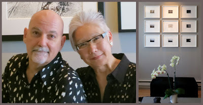
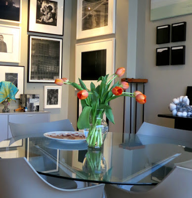
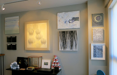
Mari Iki and Martin Maguss are San Francisco collectors. They are avid collectors and have amassed an impressive collection with a modest budget. Over the years, they have purchased works by artists such as Andy Warhol, Robert Rauchenberg, Keith Haring, Francis Bacon, Nan Goldin, Gary Simmons, Vik Muniz—the list goes on. They have also been great supporters of the many local art galleries. Pam and I met them in the late 1990s at the first Blackman art fair at Fort Mason where they purchased a small print from us. At a recent dinner for the artist Gary Simmons, we found out that Martin began collecting art in high school. I wanted to see their collection, and I asked if I could interview them.
Q: Martin, when did your passion for collecting art begin?
Martin:
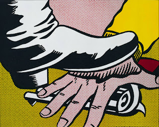
My dad instilled the values—you save up, then you can buy what you want. Growing up in Canada, I was excited about American culture. In high school, Lichtenstein and Warhol were on my radar. I had a part-time job and saved enough to buy my first piece.
Q: The Lichtenstein was the first piece you purchased?
Martin:
Yes. I showed it to my dad, and said, “I bought this artwork by an American artist who I absolutely admire, Roy Lichtenstein.” My dad asked me how much I paid for it, and when I told him, he was livid. I said, “Wait a minute. You told me to save, and if I saved enough money, I could buy whatever I wanted. So this is a win for everybody. Now I want to go to New York and meet Andy.” My dad said, “Andy who?” I told him, “I want to meet Andy Warhol.”
Q: How did you know about these artists?
Martin:
I was attracted to pop culture. While in high school, I’d also spend my free time in the National Gallery of Canada looking at Claes Oldenburg’s Bedroom Suite and the work of James Rosenquist. Expo 67 was also a big influence, because the American pavilion exhibited all the Pop artists. I travelled to Montreal to see it!
In university, I majored in graphic design and photography. I spent a great deal of time with close friends, having wonderful dialogues about the current artists—Julian Schnabel, Francesco Clemente, and others in the early 1980s.
Q: Did you get to meet Andy Warhol?
Martin:
Yes. I got on a Greyhound bus and went to New York. It was a different time, you could just do it. I’d met him a couple of times in Toronto as well. Meeting him really did change my perspective on art.
Q: So when you and Mari met, your relationship revolved around art?
Martin:
We were talking, obviously, a lot about art. She took me to the Berkeley Art Museum to see this painting that she just loved.
Mari:
I said, “Oh, you have to see this museum, because it’s just great.” I would go there all the time. I showed him my favorite piece—a painting by Francis Bacon.
Q: Mari, was there a conscious moment when you decided to start collecting?
Mari:
For as far back as I can remember, whenever I travelled with my family, I went to museums. I stood in line to attend the Avedon retrospective that David Ross curated at the Berkeley Art Museum. I had all these posters of amazing shows that I’d been to. Later, after Martin and I met, we went to the Fraenkel Gallery.
Martin:
That was October 1984.
Mari:
Martin asked Jeffrey Fraenkel to show us the Mapplethorpe still lifes. They were gorgeous black and white images of orchids. I forget how much they were—$500, $700—but I just said, “Wow…that’s so much for a black and white multiple.” Martin told me, “You spend money on posters, you should think of getting the real thing. Like these photographs, they’re beautiful.” We never got one!
Before I met Martin, I used to go into the Stephen Wirtz Gallery, always looking at Raymond Saunders’s work. Later, I went in with Martin and looked at a Raymond Saunders print maybe ten times. Finally, with guidance from Stephen Wirtz, the Saunders print was the first piece that I purchased.
Q: But did you have to agree on this, or was this your own endeavor?
Mari:
That was my first contemporary art “acquisition,” but we do tend to agree.
Martin:
The amazing thing about our relationship is if Mari and I see an exhibition, we will usually independently pick out the exact same piece. We have to work within a budget—we don’t have a lot of “disposable income”—we both have regular jobs.
Mari:
Frankly, when we’re interviewed about collecting, it’s to show that anybody can collect.
Q: There must have been a point at which you realized…
Mari:
We saw a segment on 60 Minutes in 1995.
Q: It’s not about the Vogels is it?
Mari:
Yes—Herb and Dorothy!
Martin:
We had an epiphany. They were such an influence to us! They didn’t have a fancy New York City lifestyle, and they had a comparable budget to work with. We thought, “Here are people who think in a similar way.”
Mari:
They have some of the same priorities! It’s okay to not want to get a new sofa or something, but to purchase art. Most of our decisions revolve around looking at or purchasing art. Our friends thought we were crazy.
Q: I want to focus for a moment on the idea of curating a collection. Do you have an overarching idea for your collection, or is it based on a gut reaction?
Mari:
It is an informed gut reaction. I once asked a friend why a museum director had spent extra time with us. He said, “Because I explained to him that you have a collection.” I said, “But we don’t have a collection. We just collect.”
Q: Is that how you still think of it today? Or now that you have all this work, do you feel a sense of responsibility?
Mari:
We do feel a certain responsibility. What happens to it when we’re not here? We haven’t really come up with…
Q: The perfect plan?
Martin:
Yes. The one thing we’re consistent about…for any work in our collection, we will always loan for educational purposes. It’s for the betterment of the artist’s career; it’s not about us, it’s for them.
Q: What about your relationship to the artists who make the work? Is it important to meet the artist? Or does that change the relationship?
Mari:
When we can meet them, it’s wonderful. For example, Sean McFarland, who shows at Eli Ridgway Gallery, is an emerging photographer, and we’ve learned a lot about his work by getting to know him.
Martin:
I’ve always said to Mari, if there’s an opportunity to meet an artist, we should. I remember when Mari met Diebenkorn and Thiebaud; I met Warhol, Haring, and others. If you can hear them talking about their work, that’s the best!
Q: There’s no substitute for that.
Martin:
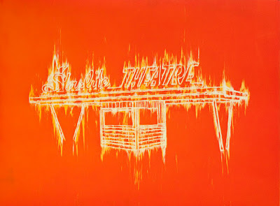
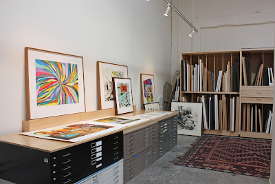
You’ve worked with Martin Puryear, Caio Fonseca, Radcliffe Bailey, Gary Simmons, and other artists that we admire. Artists that are continuing the line of creativity. Whether they work with paint, wood or other media—when they come into your studio and address another medium, the creativity is all the same! For us, there’s little distinction between painting, drawing, and works on paper.
Q: What is your advice to the novice collector?
Mari:
Look everywhere, read a lot, and then remember to look at the new and emerging artists and galleries.
Martin:
Mari and I spend an inordinate amount of time not only looking at work, but also talking about work. We’re always looking, even when we know we won’t be purchasing. We never buy for investment.
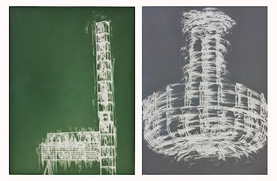
There are always opportunities for young collectors. Someone might not have the budget for a Kerry James Marshall painting, but they could consider one of his amazing prints.


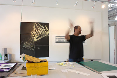
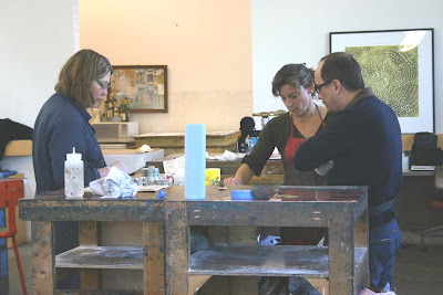
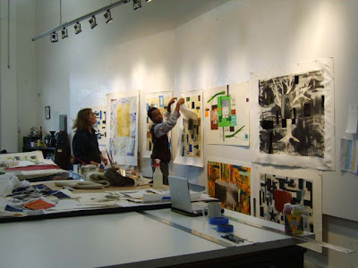
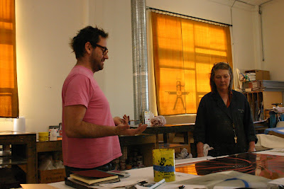
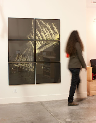 Gary’s studio was located on one of the many floors of a vast studio building in Chelsea. At that time he had an exhibition up at Metro Pictures. He said the next few years were extremely busy for him, but he would consider our invitation to come to the east bay and make prints.
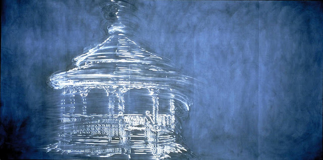
