The exhibition Mine brings together new works by McArthur Binion and Alicia McCarthy. Re:Mine is the title of a print by Binion as well as the title of the first monograph of his work. Both Binion and McCarthy bring their very personal and emotional content to the minimalist grid.
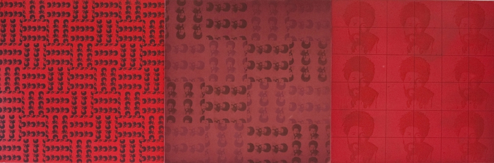
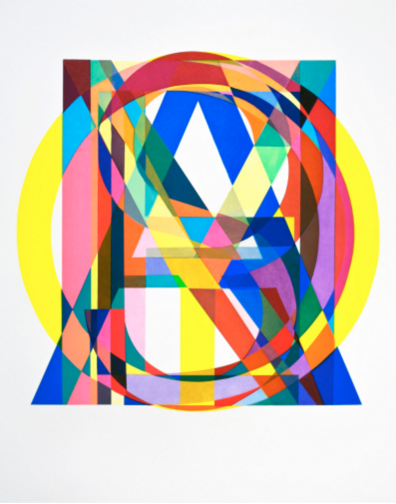
McArthur Binion, RE: MINE, 2016 Color aquatint and hardground etching. Paper Size: 25.75″ x 58″; Edition of 25
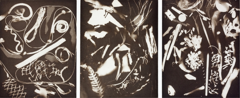
Binion often makes his marks with a monotonous, task-based approach that speaks to his personal history of manual labor in the cotton fields of the South. He also explores this history by using personal ephemera, images of his birth certificate, a handwritten phonebook, and photos on which he paints. Over the past 50 years, he has developed a unique visual language through the fusion of minimalism and narrative: Binion calls this his “handmade geometry.”
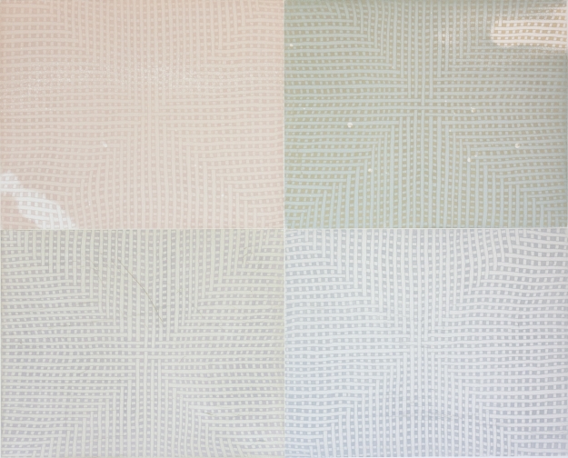
Alicia McCarthy, UNTITLED (DEUCE), 2016. Color aquatint and softground etching with drypoint. Paper size: 30.5″ x 36″; Edition of 35
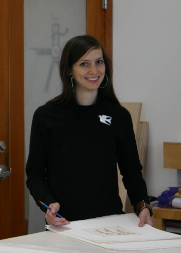
Although visually abstract, Alicia McCarthy’s works are intensely intimate and often include an indication of physical presence. The art critic Roberta Smith writes that McCarthy’s woven paintings “combine handmade quirkiness and a personal, slightly visionary geometry with an echoing perceptual subtlety.” Her graffiti sensibilities—her need to tag or mark a space as her own—appear in her work in the form of a ring left by a coffee cup, a shoe print, or a note written by the artist. In her project at Paulson Fontaine Press, McCarthy used old ink mixes from past projects, bringing a specificity of time and place into her etchings. McCarthy’s print Z.P.R.R.A.Y uses the first initials of the entire staff at Paulson Fontaine Press and becomes another memento of a shared experience.
In its 20-year history, Paulson Bott Press has worked with an unusually high number of African American artists, including Edgar Arceneaux, Radcliffe Bailey, McArthur Binion, Thornton Dial, the Gee’s Bend quilters, Lonnie Holley, David Huffman, Kerry James Marshall, Martin Puryear, Lava Thomas, and Gary Simmons. Kenneth Caldwell sat down with Pam Paulson and Rhea Fontaine to talk about their experiences with some of these artists.
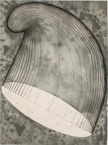
Phrygian by Martin Puryear. 35″ x 28″ color softground etching with spitbite aquatint, aquatint and drypoint, 2012.
A number of the artists you’ve invited to make prints with you have been African American. Was there an intentional strategy?
Pam Paulson: We saw that there was a real vacuum to be filled. There was no one really representing artists of color in a big way.
Rhea Fontaine: And not just in fine art print publishing, but in the larger art world.
PP: Prints are democratic. They make an artist’s work affordable, giving more people the opportunity to get into the art market. We’ve always wanted to have wide-ranging conversations with a broad audience. At the same time, whenever we invite artists to work with us, it’s because we respond to their art.
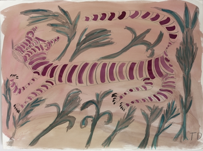
Tiger Wants to be Alone by Thornton Dial. 22″ x 30″ Watercolor and graphite on Lanaquarelle paper, 1990.
RF: There is a real moment right now for artists of the African Diaspora in institutions because audiences want to see these voices better represented. I was at the Whitney Museum’s inaugural exhibition, America Is Hard to See, and it was so good to see paintings by Al Loving, Alma Thomas, Noah Purifoy, and many others who, at points, were overlooked by history.
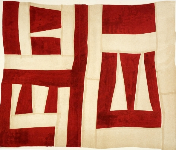
Passing By by Mary Lee Bendolph. 39″ x 43″ Color softground etching with aquatint, spitbite aquatint and chine colle, 2007.
Talk about how you ended up working with the Gee’s Bend quilters.
PP: I went to New York at the end of 2002 and took my family to the Whitney Museum when the Gee’s Bend quilt show was there. We saw the beauty in the patterns and the improvisational genius. Their work was the visual equivalent of jazz.
Then my dad, who was in his mid-80s at the time, was at my house one night, and I was showing him the catalog for the show. I told him, “I was so blown away by this, Dad. You would have loved it.” And he said, “Why don’t you make prints for them?”
But we needed a way in. We couldn’t just walk into Gee’s Bend and ask these ladies to come make prints. We hit a lot of dead ends. Finally I called up Radcliffe Bailey, who had told me he had been to Gee’s Bend. I asked him, “Would you drive down there with me? I want to see if I can get some of the quilters to make prints with me.” The next night, he was at a dinner in Atlanta with a group of art people, and Matt Arnett was there—and Matt’s family represents the Gee’s Bend quilters. Radcliffe knew Matt because they grew up in the same town. He sat next to Matt and said, “My friend Pam, who I make prints with, wants to make prints with the Gee’s Bend quilters.”
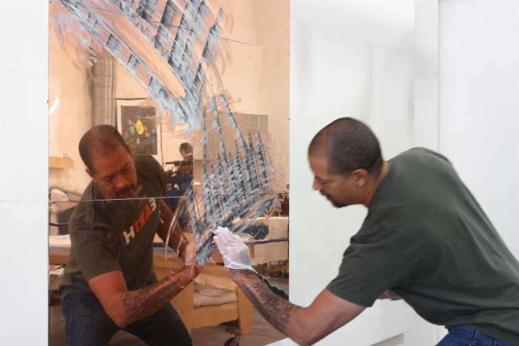
Radcliffe Bailey applying spitbite in Paulson Bott Press.
Matt called me the next day. Then we were on the phone for the better part of a week. He really wanted to make sure that we were sincere and in no way going to take advantage of the quilters. He was also really interested in taking their work out of the purview of craft and putting it under the purview of art. The show at the Whitney had started to do that, of course, but working in another media besides quilting was going to take it one step further.
At one point, I said to Matt, “If they come and we don’t get anything, I don’t care. I’m just in it for the experience of trying.” And he was satisfied with that, so the quilters came to our studio.
Untitle Woman by Kerry James Marshall. 24.5″ x 19″ hardground etching, 2010.
RF: It was our first time working with textile-based artists. Pam and Renee devised this idea of working with soft ground. We had no idea that the translation would even meet our expectations, but it far exceeded them. I came in the day after our printers started working with the quilters, and there were already so many works on the walls. It’s like we dove into a whole new world.
PP: It was so rewarding. It was like being at church. There was a lot of song and praise and gratitude going on while they worked. It was one of the most fun projects we’ve ever done.
Then after we did the prints, we took them to the print fair in New York the next year, and Jo Carole Lauder from the Foundation for Art and Preservation in Embassies saw them. She asked us to do prints with the quilters for their program. So four of the quilters did an edition of 50, and they are placed in US embassies worldwide.
The Things of Life (To See or Not to See) by Lonnie Holley. 19.5″ x 39″ color aquatint, 2013.
After Gee’s Bend, David Huffman and Lonnie Holley came, didn’t they?
RF: Yes. David is a good friend and someone whose work I have admired for many years. He is the first artist we published who was working with the stereotypical iconography of race in America. One of his early characters, named Trauma Eve, made a major impact on me. His fearless exploration of themes related to the legacy of slavery, postindustrialism, Afrofuturism, and the counterculture continue to fascinate.
Lonnie Holley at Paulson Bott Press.
How did Lonnie Holley come to work with you?
PP: The Arnetts have a large collection of artworks by self-taught artists from the South. After the Gee’s Bend experience, we went down the Arnetts’ Atlanta warehouse, which is gigantic, and talked about all the different artists they collected. Lonnie Holley was in their collection—his sculptures using found objects were beautiful. Lonnie also introduced the Arnetts to Thornton Dial, a groundbreaking African-American artist known for his large-scale assemblages using found objects.
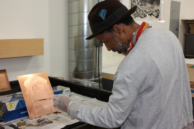
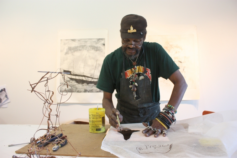
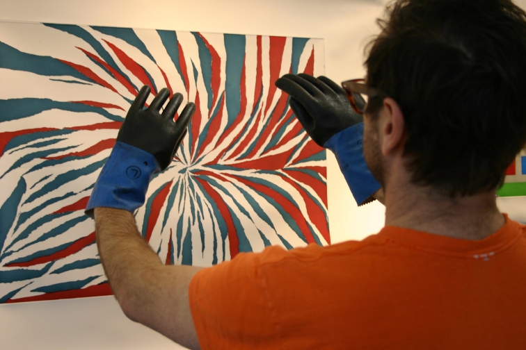
McArthur Binion at Paulson Bott Press.
RF: People like the Arnetts, who support the Gee’s Bend quilters, and Lowery Stokes Sims, whose pioneering work at the Metropolitan Museum and the Studio Museum in Harlem introduced so many minority artists to larger audiences—these are the people who are taking risks that others aren’t willing to take, saying things that other people aren’t willing to say, seeing things that other people are not seeing. We’ve always wanted to connect ourselves with that type of visionary. Because of them, a number of extremely talented artists have become known to us and the world at large.
Interviewer: Tell me what you’re working on here in the studio.
Tauba Auerbach: I’m doing lots of weaving. I’m exploring topological interactions of threads and fibers, using a couple of different techniques. One is this monochromatic system where the contrast in the pieces comes from the difference in the length of the float, which is the term for how long a strip is in the “over” position. In this other type of weaving with two colors, which is something called shadow weaving, it’s a checkerboard weaving pattern. It reverses in some sections, and therefore, the direction of the stripes reverses.
Q: What are you weaving on?
TA: Directly onto the stretcher. First I draw a pattern on the computer using Adobe Illustrator. This pattern isn’t a description of what the piece is going to look like when it’s finished. It’s a description of what position each strip is in. They are like instructions.
Q: Almost like a simple computer program, like we used to do with punch cards?
TA: Yes, but there’s nothing automated about it. I draw every square, but I just benefit from being able to cut and paste on the computer. I make this colored pattern and one person reads the pattern calling out the ‘over’s and ‘under’s, and the other person weaves it.
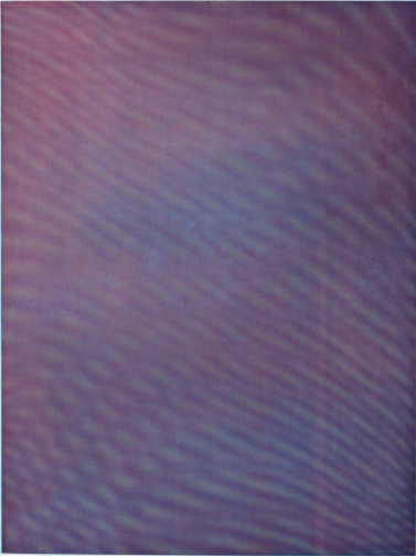
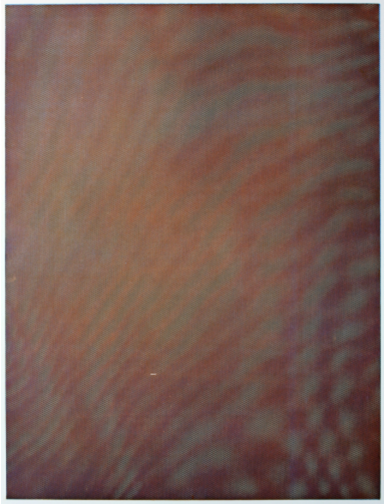
Mesh Moire III by Tauba Auerbach, 2012.
Q: Do you always stick to the pattern you’ve laid out?
TA: Often, once I get part of the way into weaving, I’ll realize there’s something I don’t like. Then I make an alteration to the pattern.
Q: You go back to the screen?
TA: Yes. This still happens a lot, because I’m still learning how to do this. I’m still making it up. There are some things I can’t predict. For example, I just don’t know how the shadows are going to fall.
Q: The diagram on the computer doesn’t capture light, does it?
TA: I have a flat drawing. And a lot of the visual information you’re getting, especially in the monochromatic pieces, has to do with shadows. Sometimes I make patterns on the computer that look really exciting. And then we weave them, and it looks like nothing. It just looks so flat and boring. There can be other surprises in the good direction, too.
Yes or No & or Yes & No by Tauba Auerbach, 2008.
Q: How did this evolve out of what you were doing previously?
TA: I’ve been interested in topology for a long time. That naturally led me to weaving, because when you weave, essentially, you’re working with two complete planes that are changing places over and over again. I also have a fascination with things that I would consider technologies that we don’t talk about as technology anymore, because they’re old, like rope-making and weaving.
Some of the strongest high-tech materials that we use now are woven, like carbon fiber, for example. It’s not just the material properties of the carbon fiber, but also the way it’s arranged that gives it its strength.
As artists, we’re painting on woven material all the time, this sort of invisible support. I thought I’d burrow into the support and into the material and build it back from scratch, in a way.
The third reason is that I was preparing for a show that’s traveling called Tetrachromat. A tetrachromat is a person who has a fourth color receptor on their retinas, whereas the standard human has three. There has been quite a bit of evidence recently that there are human tetrachromats—they’re all women, because this is carried on the X chromosome.
I was trying to imagine what the tetrachromat’s world is like. I developed this monochromatic weaving during that time, because one of the things I learned about likely tetrachromacy is that the mutated, extra receptor would not allow a person to perceive colors outside the normal, standard spectrum visible to humans—like ultraviolet or infrared. The perception would be between the red and the green. There would be a dramatic increase in sensitivity and an ability to distinguish between yellows that look all the same to us, or things around the yellow range. So tetrachromacy is the ability to see variety and maybe depth or light or shadow in things that look the same to most people. Weaving seemed like a natural way to try to investigate that kind of variety within one very simple color or non-color.
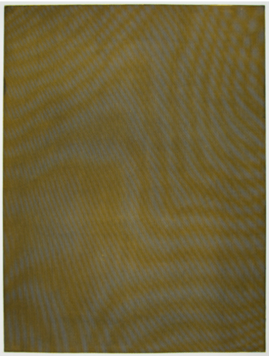
Mesh Moire I by Tauba Auerbach, 2012.
Q: Wow. A more mundane question. You cut these strips?
TA: Yes. They come on big spools. There’s a very specific spacing. And at the end, we straighten the whole thing with a big long ruler and push all of the strips into a straight position.
Q: And then you have to unstaple it all and restaple it?
TA: I don’t have to unstaple. We staple all the ones going the horizontal way. When we’re weaving the verticals, we just pin them on the back. Then at the end we pull them really tight and staple.
Q: Tell me more about this technique.
TA: I was doing weaving research, and I came upon this technique called shadow weaving. I think it’s called that because, if you were to isolate this shape, it appears that there’s a shadow on this side and a highlight on that side. By reversing it, you get the stripes running in different directions. And I’ve pretty much only seen it used to create straight shapes. I’m trying to see what can happen with something a little bit more complicated than that. This is only the fifth one that I’ve done using this technique. So I feel like I’m really at the beginning of something with this and not quite sure where it’s going yet.
Q: Do you finish one of these and decide it’s not good enough?
TA: Often.
Q: Then, what happens?
TA: Take it apart.
Yes by Tauba Auerbach, 2005.
Q: I remember you commented that with some of the other accidental works that involved broken glass, you threw out an enormous amount of work and started over.
TA: Fortunately, in this case, I can just take them apart and reuse all the materials.
Q: How many don’t work out?
TA: Perhaps two out of every three I take apart or alter in a significant way.
Q: This is after you’ve designed it and woven much of it?
TA: Yeah. Sometimes it’s just taking out a section and reweaving. But I hope to get better at predicting what they’re going to look like.
Q: In one of our conversations a few years ago, you said that there was lot of thought that went into every piece before you made the piece itself. In other words, the work was more in the thinking than the doing. The last time we spoke, you said you were spending less time thinking ahead and more time doing…and then discarding. Now this time it seems like a combination of both approaches.
TA: You’re right. I have to plan it out. But there’s still a lot that depends on accident, a lot that I can’t predict.
Q: You were doing a lot of airbrush before you were using this newer technique. Are you constantly looking for change?
TA: I think change just naturally happens all the time.
This interview with Kenneth Caldwell appeared in the May-July 2013 issues of SFAQ.
In a 2002 article for the San Francisco Bay Guardian, critic Glen Helfand coined the term “Mission School” to describe the work of Barry McGee, Margaret Kilgallen, Chris Johanson, and other young artists who were based in the Mission District at the time and drawing influences from graffiti, comic books, social activism, and the grit of urban living. Paulson Bott Press has had the opportunity to collaborate with a number of these artists, and as part of the press’s 20th anniversary, Pam Paulson and Rhea Fontaine sat down to talk about their experiences with the Mission School.
Margaret Kilgallen at Paulson Bott Press.
How did you first become involved with the Mission School artists?
Pam Paulson: In 1998, the Headlands Center for the Arts contacted us. They wanted us to collaborate with an artist to make a gift print. Margaret Kilgallen was one of the artists on their list. We knew about her work and liked it, so we chose her. Afterward, Margaret recommended that we work with Chris Johanson some day. When Chris came to us a few years later, he recommended Shaun O’Dell. All the Mission School artists were very connected to each other and supportive of each other.
Shaun O’Dell at Paulson Bott Press.
Today these artists are celebrated, but what was your experience with them early on?
PP: The first time we went to Chris Johanson’s studio, I remember thinking it looked like a bombed-out building. His studio had holes in the floor, and there was just debris everywhere. This is where he made his art.
Rhea Fontaine: They were young artists with no interest in money, and they had an openness to neighborhoods that were considered more fringe.
Chris Johanson at Paulson Bott Press.
Margaret and Tauba Auerbach—their early work seemed to share something.
RF: They were both influenced by sign painting, typography and book arts early on. When Margaret was getting her MFA at Stanford, Tauba was an undergrad there. And like so many other fans, Tauba was influenced by Margaret’s work. Tauba’s first job out of college—and I think I remember her saying it was much to her parents’ dismay—was sign painting at the New Bohemia Signs shop in San Francisco. She loved it, and it influenced some of her early text-based and calligraphic paintings. When we were working with her on our second collaboration, she announced that she had quit the sign shop and was going to pursue painting full time. It was a very big moment for her.
Tauba Auerbach at Paulson Bott Press.
How did the Mission School come to such prominence?
RF: There were some key players who were nurturing that talent and promoting it here and also outside the Bay Area. Jack Hanley Gallery was a big part of that, as well as the Luggage Store Gallery and Adobe Books—Chris Johanson met his future wife and fellow artist, Johanna Jackson, at Adobe Books, by the way. But the attention that Margaret Kilgallen and Barry McGee received for their really innovative styles was key. They began a movement without even knowing it. Of course, all of these other artists that we’re talking about now were working in the Mission at the same time, like Alicia McCarthy, (who we’re so excited to have worked with finally).
Alicia McCarthy at Paulson Bott Press.
They all came from very different backgrounds, didn’t they?
RF: Tauba Auerbach had creative parents, so she was raised around art and went to Stanford. Chris Johanson was more self-taught. He was part of an earlier punk/skate/zine scene that influenced younger artists like Tauba Auerbach, among so many others. So they’re coming from completely different worlds, and I think they’re both true to the worlds they’ve come from.
PP: Alicia McCarthy was born and raised in Oakland, and she’s also a musician, and part of a multi-genre community that many of these artists worked in. She has a really mischievous soul. Her dad works on cars, like Tauba’s dad. I think she grew up around people putting things together and taking them apart, and just saw everything as a component to something else. So when she worked on found objects, I think she had just a real eye for that material. That unites her with Johanson and the rest of the artists. When she was working with us, for instance, she saw the scratched back of an old plate, and that’s what she wanted to use in one of her prints.
How did Clare Rojas become involved with the Mission School artists?
PP: She was a fan of Barry and Margaret’s and met them back east. She had a passion for their work, and she was a musician too.
RF: She sent them some of her recordings, and they fell in love with her music.
PP: Margaret died in 2001 from breast cancer, a few weeks after giving birth—she was only 33. Some time after that, Clare moved to San Francisco. She saw a real need to help Barry with his daughter Asha—and then things fell into place.
RF: They got married.
Clare Rojas at Paulson Bott Presss.
Talk about Jack Hanley. He seems like a central character in all this.
PP: He had a gallery in the Mission at the time. He’s a musician too. As long as I’ve been in the art world, he’s had a gallery.
RF: Jack likes taking risks on people who most galleries would never have paid attention to. He has a real eye for talent. I can remember Jack supporting artists in legal battles over graffiti charges. A lot of these artists were really living a hand-to-mouth existence back then.
But then Jack moved to New York in 2008?
RF: Yes, now he has a gallery in the East Village. It was a big loss for the Bay Area when he moved. He showed a lot of New York artists here. He’s always been very avant-garde. He was one of the people who suggested we work with Keegan McHargue.
PP: Now the Mission School artists have spread out, and they’re refining their work and growing up.
It’s an interesting time for art that’s rooted in resistance.
RF: As an artist matures and wants to continue being a working artist—there is this dance that needs to happen between their work and the institutions that support them. That’s an interesting thing to navigate for artists who’ve built legacies out of shunning the system. The show by Barry McGee at the Berkeley Art Museum a few years ago was really interesting. Just looking at his installation, you could feel him grappling with being in a museum space. There’s an ongoing and constant tension in the work of all of these artists, a conflict that you can’t help but feel.
On July 16, “Paulson Bott Press: Celebrating Twenty Years” opened in the Anderson Gallery of San Francisco’s de Young Museum. The show celebrates the Achenbach Foundation for the Graphic Arts’ acquisition of the Paulson Bott Press archive, which includes more than 500 prints from more than 40 artists. Featured artists in the exhibition include: Tauba Auerbach, Mary Lee Bendolph, Chris Johanson, Margaret Kilgallen, Martin Puryear, and Gary Simmons.
“It was wonderful to see a few of our former master printers on the day we first saw the exhibition at the de Young,” says Co-Founder, Pam Paulson. “Looking back and remembering all the talented and dedicated people who have been a part of our story is humbling. Each person involved with the press has contributed their unique gifts and enriched the prints we have produced and our capacity to get them out in the world.”
Gallery Director, Rhea Fontaine adds, “We are grateful for the opportunity to share our archive with a wide audience through the Achenbach acquisition and programming at the de Young. To know that our artists, many of whom are minorities and women, will be a part of this visual history and legacy is thrilling for us.”
Pictured from left to right: Rhea Fontaine, Pam Paulson, Alexander Groshong, Sam Carr-Prindle, and Renee Bott.