Paulson Bott Press: Celebrating Twenty Years
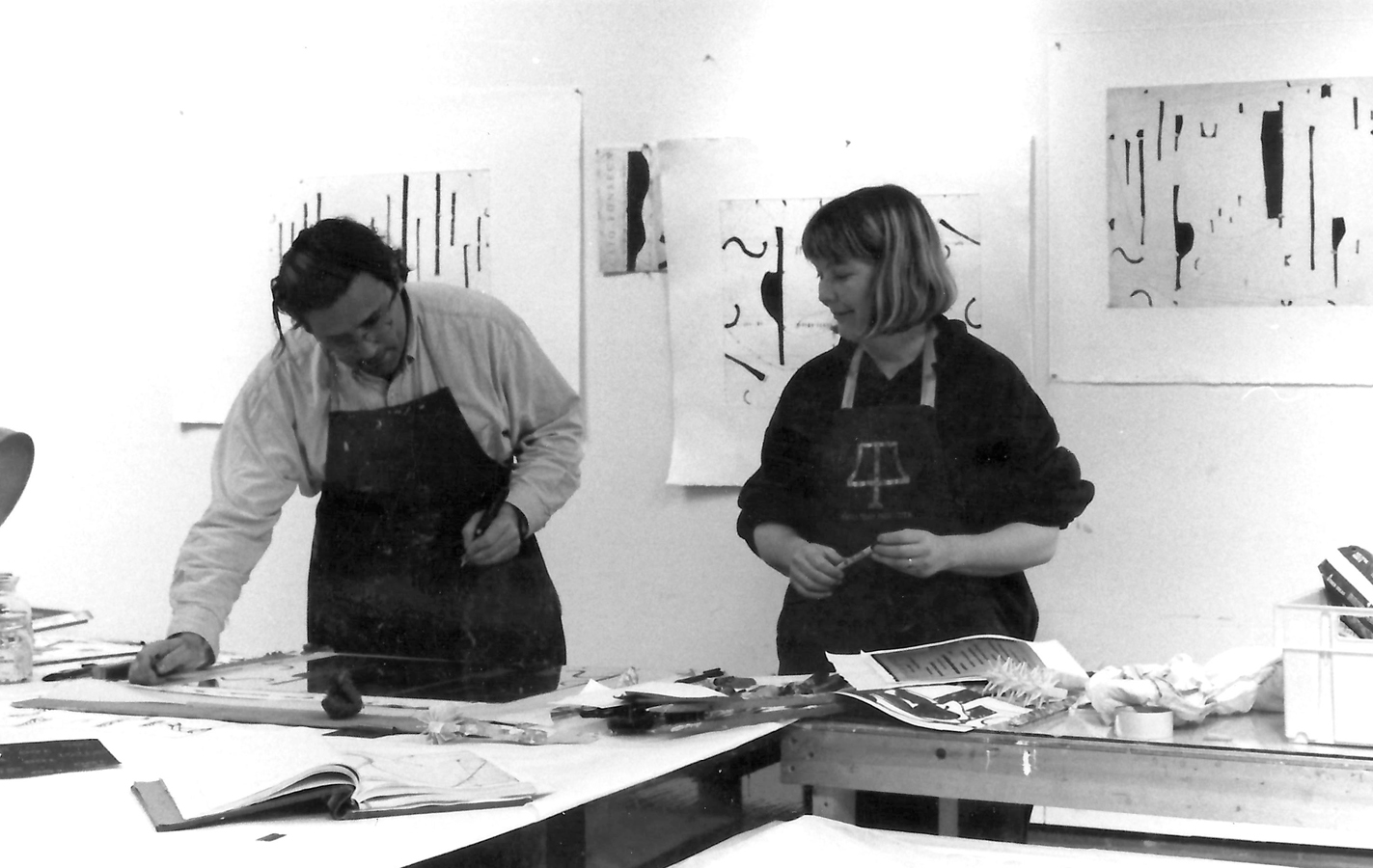
Founded by Pam Paulson and Renee Bott in 1996, Paulson Bott Press celebrates 20 years of intaglio fine art. Having launched the studio with a series of prints by Chris Brown, the press has gone on to work with numerous renowned and emerging artists.
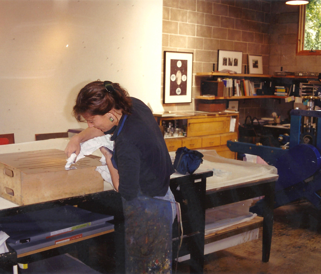
Paulson, who has a background in fine art, began her printing career in San Francisco, California. “I wasn’t a printer, but Kathan Brown at Crown Point was looking for people who had the capacity to think on their feet and physically manipulate things and who knew enough about art not to be stupid with the artists,” Paulson says. “Once I had done a couple projects at Crown Point, I was completely hooked. I was watching other people make things. It was a puzzle that you had to figure out, and it was glorious. I loved it. I make things all day, and what really connects me to art is making things. That’s what I am supposed to do.”
Renee Bott was a colleague of Paulson’s at Crown Point. “Pam had the big picture, the broader vision, while I like having the pencils in the right place: I like order,” Bott says. “She was very optimistic from the outset. I’m the one who said, ‘Okay, if we’re going to do this, we need to order a press, and it should be made this way. When I started working as a printer and working with artists, I felt like I was home. I was home. I had arrived.”
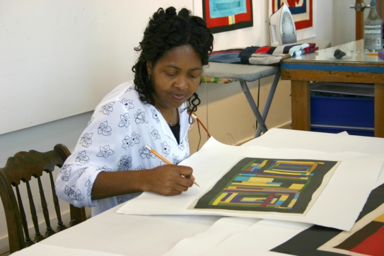
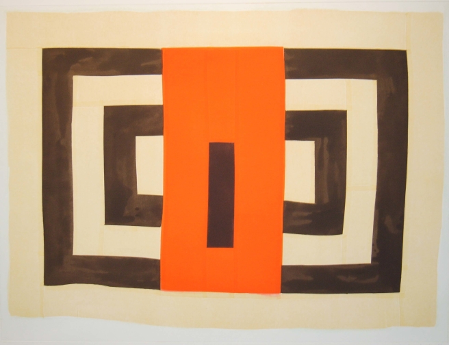
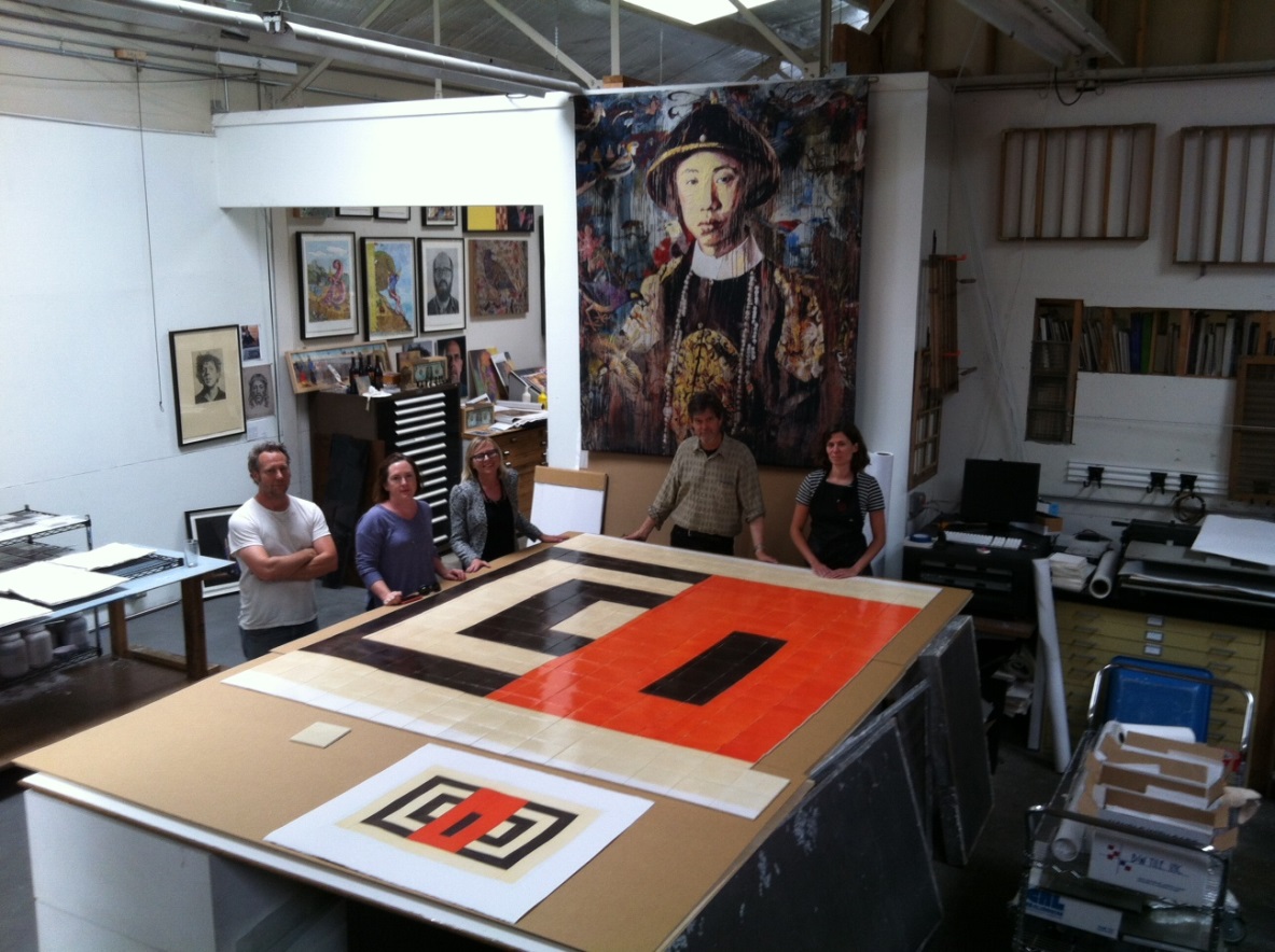
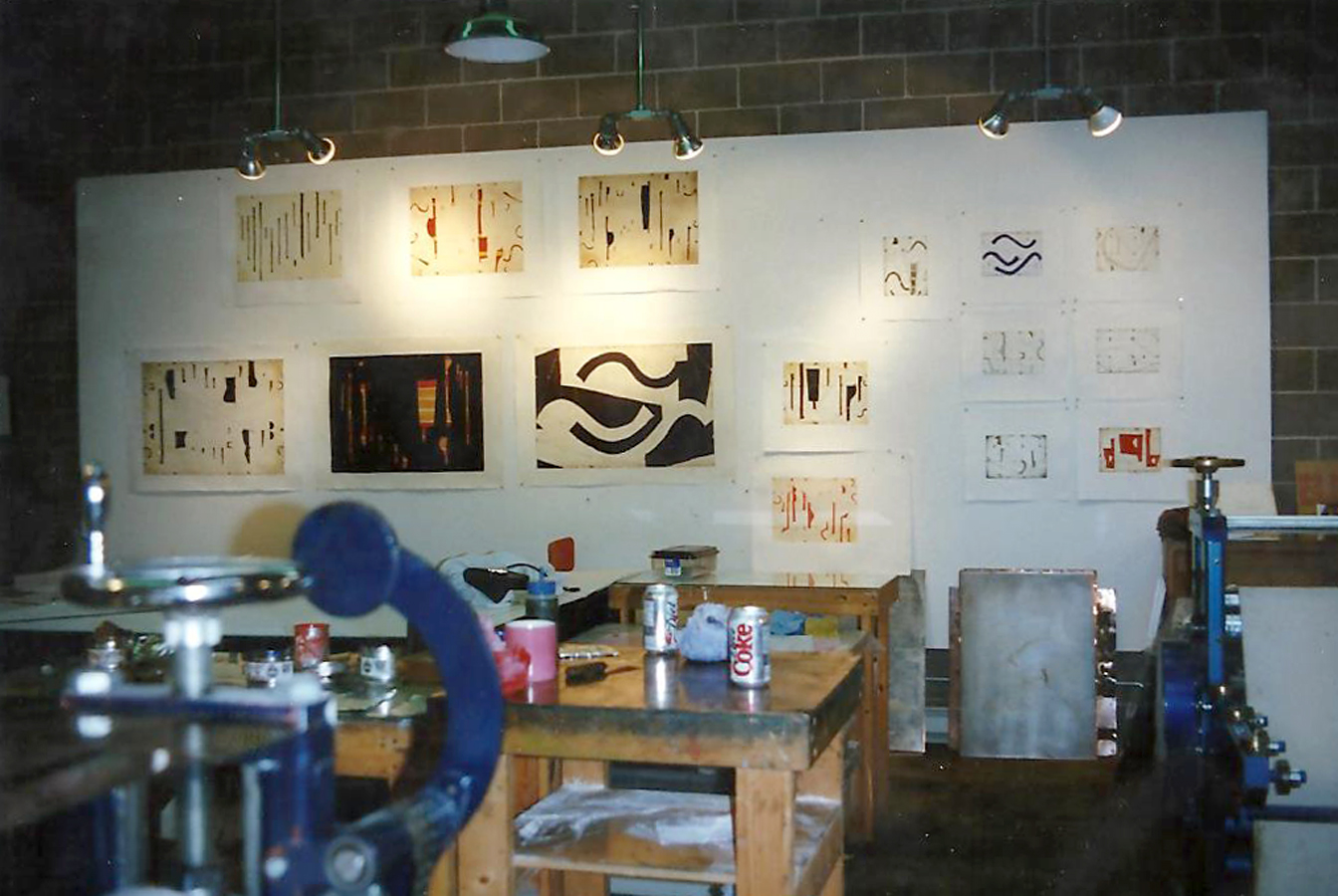
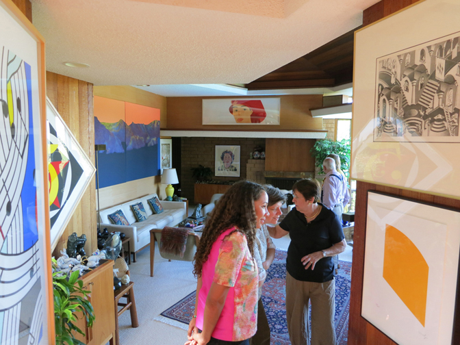
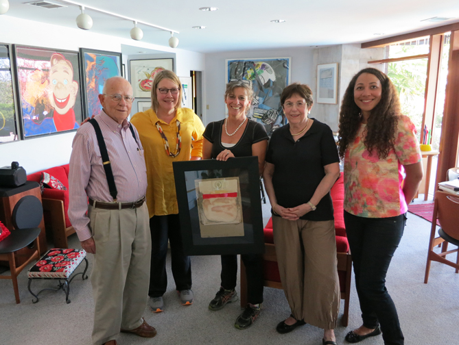
Paulson Bott considers every print that gets ripped up, or kept, as a record of what the press is doing and has diligently documented the work with a time capsule that plots history. This includes the process of working with established artists like Martin Puryear and Ross Bleckner and younger artists like Tauba Auerbach and Clare Rojas. This year, the Achenbach Foundation for Graphic Arts acquired the archive of Paulson Bott Press.
“We started this from the very first day,” Bott says. “We understood that if we created something, we wanted it to have a legacy. When there is a catalog raisonné of the work that we’ve made, we want to look back and see a strong vision.”
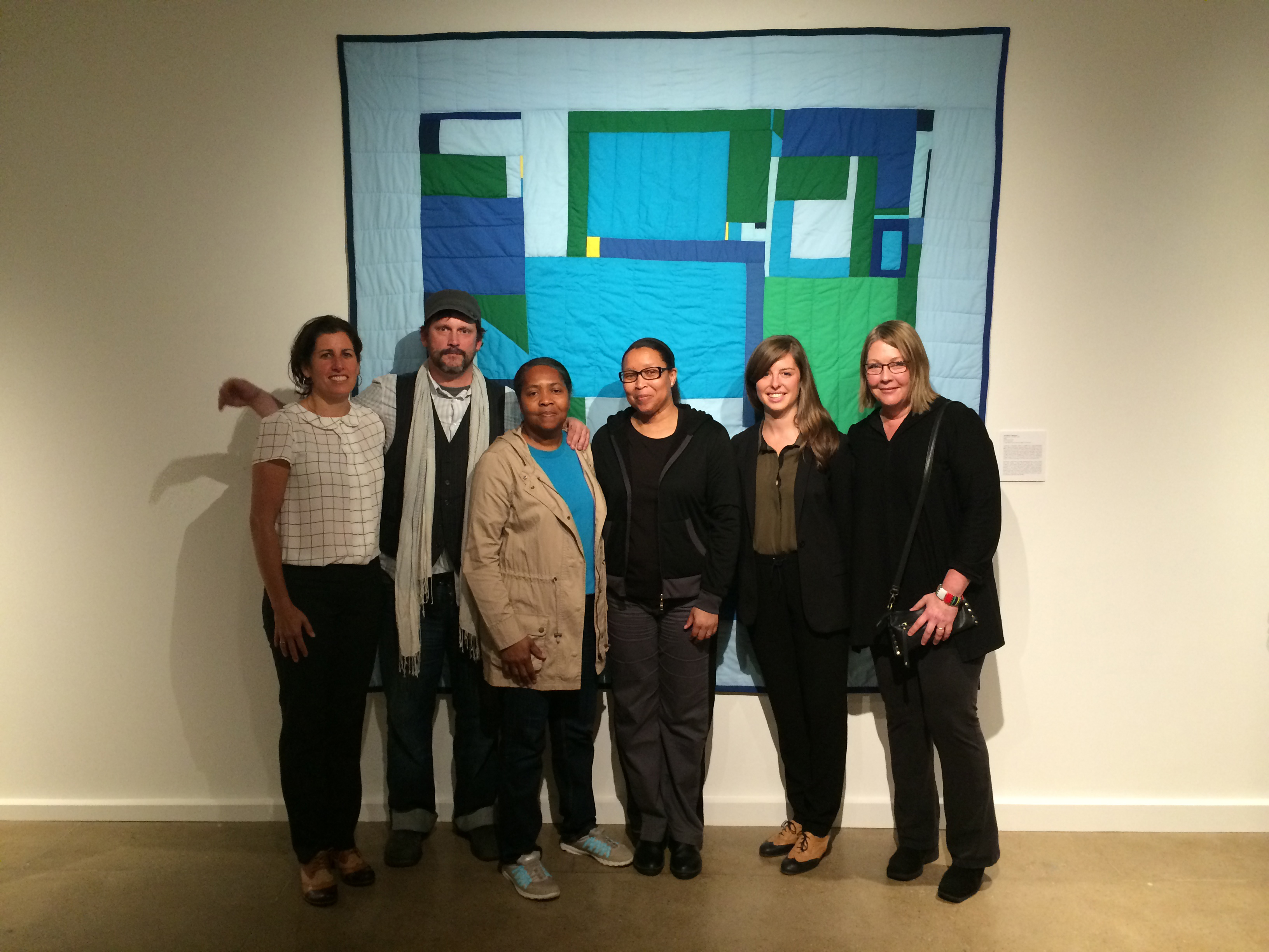
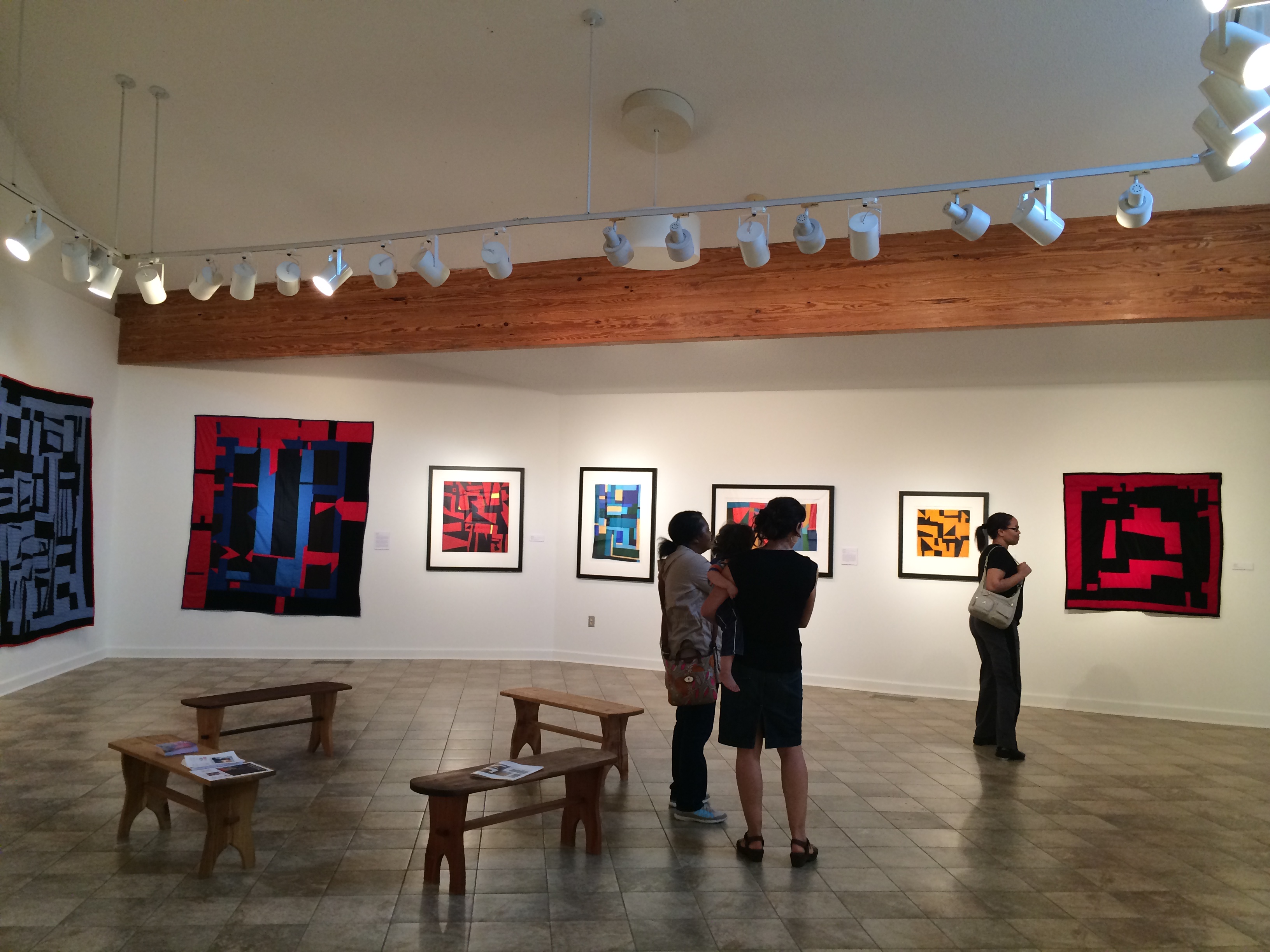
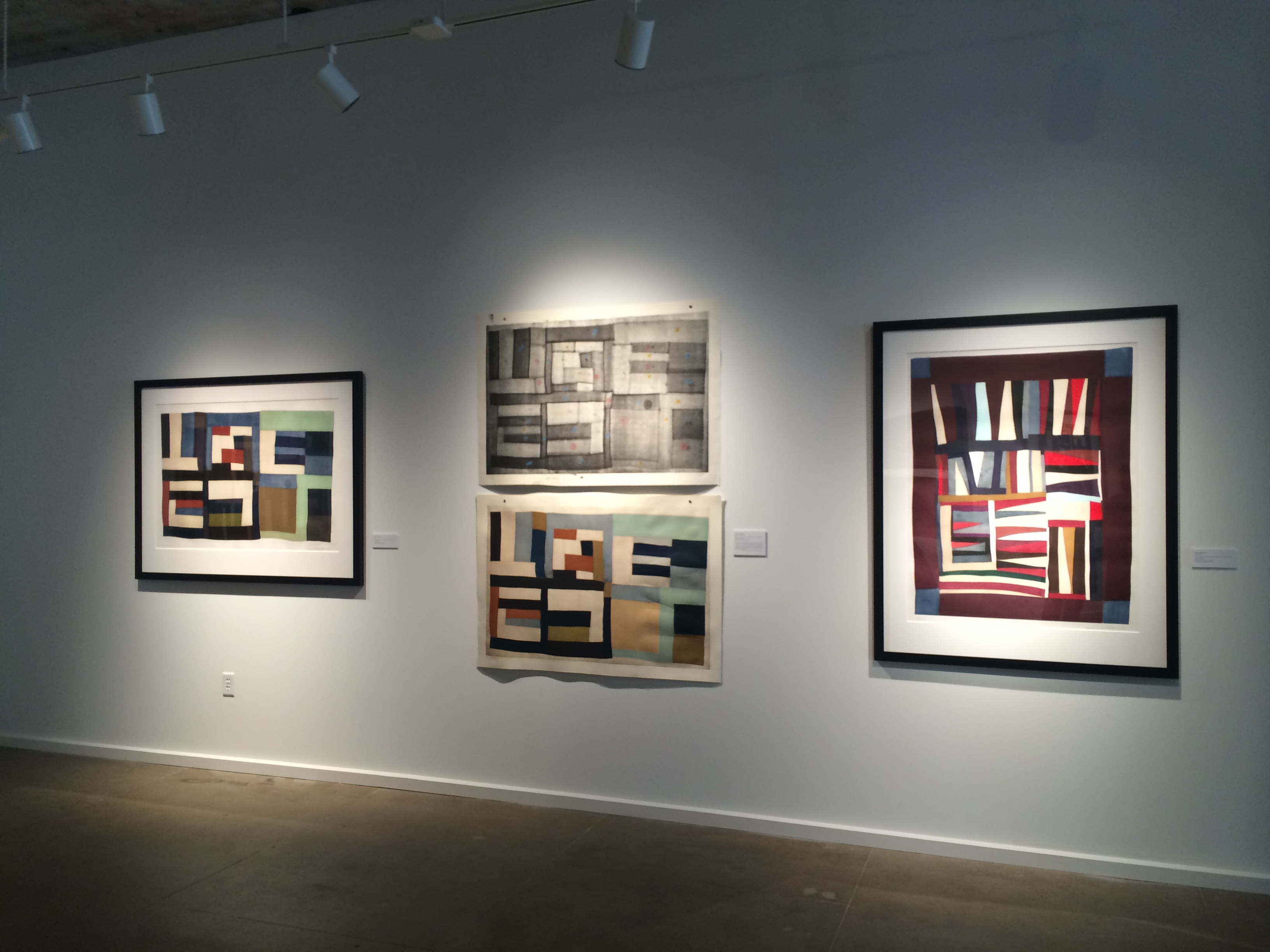
To celebrate the acquisition, the Foundation will host a commemorative exhibition at the de Young Museum’s Anderson Gallery featuring 20 artists who have worked at the press, including Tauba Auerbach, Mary Lee Bendolph, Chris Johanson, Margaret Kilgallen, Martin Puryear, and Gary Simmons.
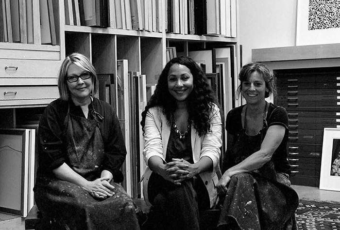
“We are interested in a broad platform with a mix of artists,” says Rhea Fontaine, Paulson Bott’s gallery director. “We are very focused on artists who add to the conversation in the realm of the work that they are doing, not just what we are doing.” The press will concurrently celebrate its catalogue with a retrospective on its Twitter and Facebook pages. Follow the conversation under the hashtag #20years20stories.
The show at the de Young will open next month on July 16, running through October 23, and can be viewed with general admission access.
Tickets can be purchased online or at the museum.