Sharing the Passion. An Art Collection at Stanford.
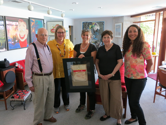
Recently we had the pleasure of visiting some of our collectors at their home on the Stanford University campus.
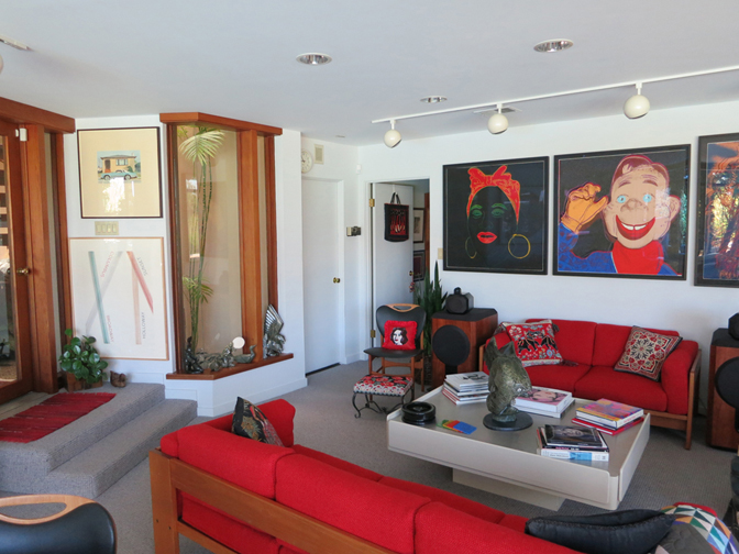
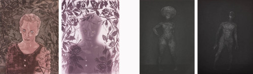
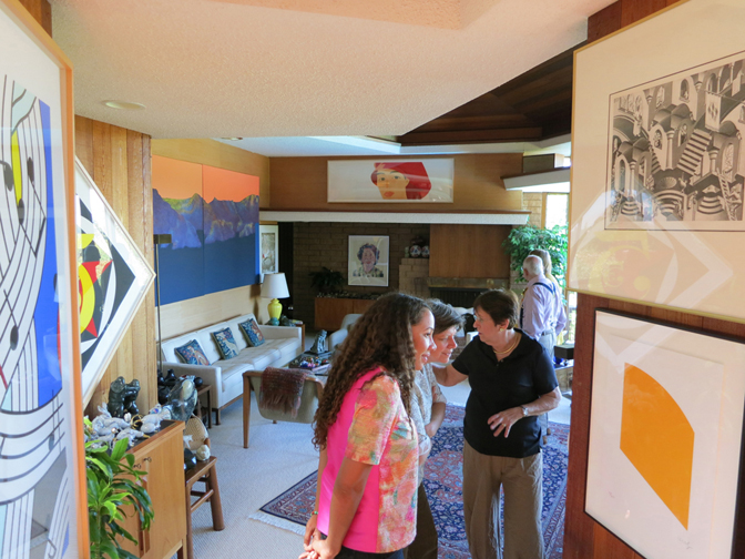
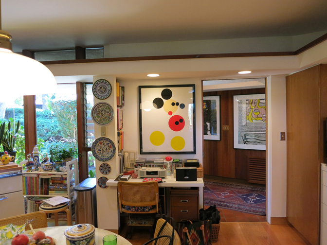
This couple has been collecting since the 1970s and has put together a stunning collection of prints, photos, and works on paper. With an early focus on Lichtenstein and Warhol, the collection now includes seminal works by Ansel Adams, Robert Bechtle, Damien Hirst, Ellsworth Kelly, Alex Katz, Sol LeWitt, Chris Ofili, Robert Rauschenberg, and Ed Ruscha, to name a few. We were thrilled to see etchings that we made with Isca Greenfield-Sanders and Christopher Brown on the walls of this midcentury home designed by Bates Elliot.
One of our friends is a recently retired engineering professor at Stanford University, where he taught for 50 years. His work in the field of neural engineering led much of the modem technology we all enjoy today. During the lovely lunch that our other friend prepared for us, he told the story of their introduction to visual art by fellow professor, Albert Elsen.
Elsen was a leading Rodin scholar at Stanford and also pivotal in the relationship that Stanford began in the 1970s with B. Gerald Cantor, the longtime supporter of the university’s art program, for whom the campus museum is named. It was Elsen who got our friends started on this collecting pursuit as he was able to communicate to the value of art. Elsen’s passion was contagious.
It was fascinating to hear the story of the beginning of their lifelong engagement with the arts. It brought to mind the ongoing discussion about how the visual arts community connects with enthusiasts in the science and technology fields. Elsen wrote a book titled Purposes of Art: Introduction to the History and Appreciation of Art. The idea of purpose, as complicated and diverse as it may be, seemed so clear to me while standing in the middle of this collection. To be surrounded by their visual expressions of thought and spirit gathered over a lifetime was truly invigorating.